NAITSA
BRAND GUIDE

About the NAITSA logo
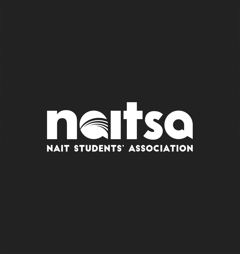
Our logo is our most valuable brand asset. It should remain consistent across our communication channels and never be modified.
The first “a” contains a link to our history, referencing the symbolism of the four arches, which are the four branches of our student governance: the members, senate, executives and staff. The shape also signifies a growing wave, symbolizing the growth and strength of students as they move through their post-secondary experience. These arches have been carried over from our last logo, in effect 2007 – 2018.
The speech bubble shape of the As represents our desire to be in constant conversation with students and external partners. We are a place where students are heard.
The full organization name is spelled out in the tagline below the acronym, for the benefit of students and external partners. Because we refer to ourselves as NAITSA, this ensures clarity of who we are.
We stand apart from NAIT in using lowercase letters for our logo, to show we are a separate entity.
For Access to Brand Materials
Please contact Jenny Lau for NAITSA brand materials (such as our main logo or department logos), and a copy of our brand guidelines.
Jenny Lau
Communications Director, NAITSA
jenny.lau@nait.ca
780.709.6333
We strive to maintain consistency, building recognizability and trust in our brand, which is why we require our logo to be used in accordance with our brand guidelines. Brand guidelines are a set of rules to create a unified identity when connecting multiple elements within the brand, such as colours, the logo, and typography.
We are proud of our logo, and require that you follow these guidelines to ensure it always looks its best.


